Typography and Graphics: Designing a Balanced T-Shirt Layout
Achieving the perfect balance between typography and graphics requires understanding visual weight, spacing, and hierarchy principles that guide the viewer's eye across the design. A well-balanced t-shirt layout creates harmony between text and imagery while maintaining readability and visual appeal. This delicate balance becomes even more critical when working with complex designs or multiple elements. For those seeking to expand their creative toolkit, exploring free tools for creating t-shirt graphics can provide accessible resources for experimenting with different layout approaches and design techniques.
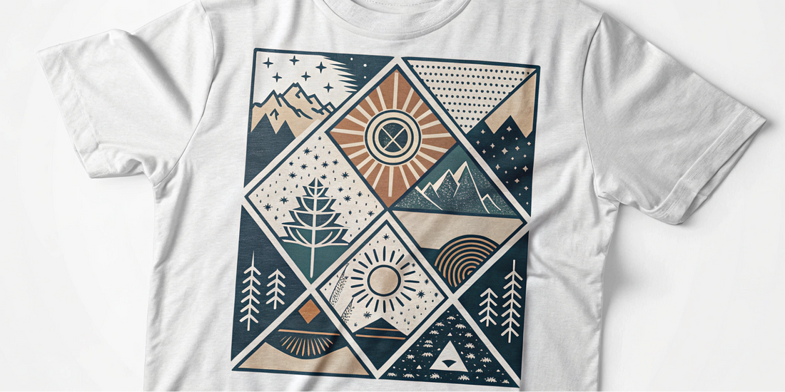
Discover perfectly balanced designs in our Vibrant Horizons Collection where typography and graphics work in beautiful harmony!
Understanding T-Shirt Design Basics
Before diving into specific t-shirt design tips, let's understand some basics about how t-shirts work as a canvas for your art.
The Unique Canvas
A t-shirt isn't like paper or a computer screen. It moves, folds, and wraps around a body. This means your design needs to:
- Look good on different body shapes
- Work well when the fabric moves
- Be visible from various angles
- Consider the shirt color as part of the design
Prime Design Areas
When planning your graphic layout shirt, know the main areas where designs typically go:
- Center chest: The most common spot
- Full front: Covering most of the front
- Pocket area: Small design on upper left chest
- Back: Either full back or upper back
- Sleeves: Side designs on the arms
Understanding these spaces helps you balance text images better on your design.
Essential T-Shirt Design Tips for Typography
Typography means how you use text in your design. Here are some t-shirt design tips for making your words look great.
Choosing the Right Fonts
The fonts you pick matter a lot. Good t-shirt design tips for fonts include:
- Use no more than 2-3 different fonts per design
- Make sure your fonts match your message
- Pick fonts that are easy to read from a distance
- Consider how fonts create feelings: playful, serious, fancy, or simple
Bad font choices can ruin even the best design concept. A good rule for graphic layout shirt design is to pair one simple font with one decorative font.
Text Size and Readability
One of the most important t-shirt design tips is making sure people can read your text. Remember:
- Main text should be visible from 6-10 feet away
- Smaller details can be for closer viewing
- Test your design at actual size
- Think about how far away people will be when reading your shirt
To balance text images properly, make sure your text is sized to match the importance of your message.
Text Placement
Where you put your text matters. To balance text images well:
- Center text is best for simple messages
- Curved text can follow design elements
- Text can frame a central image
- Leave enough space around text so it doesn't feel crowded
A common mistake in graphic layout shirt design is putting text too close to seams or edges where it might get lost in folds.
Working With Graphics and Images
Now let's look at the visual elements of your design with these t-shirt design tips for graphics.
Types of Graphics for T-Shirts
Different kinds of graphics work for different designs:
- Illustrations: Hand-drawn or digital artwork
- Photography: Real photos converted for t-shirts
- Icons: Simple symbolic images
- Patterns: Repeating designs or textures
- Abstract shapes: Non-specific forms and colors
When you balance text images, the type of graphic you choose sets the tone for your whole design.
Image Size and Placement
Getting the size right is key for a good graphic layout shirt. Consider these t-shirt design tips:
- Standard chest prints are typically 10-12 inches wide
- Full front prints can be up to 14 inches wide
- Don't place important details at extreme edges
- Allow the design to breathe with some empty space around it
To balance text images effectively, try scaling your graphics at different sizes to find what works best.
Image Quality and Resolution
For t-shirt printing, your images need to be high quality. Good design principles tee creators follow include:
- Use at least 300 DPI resolution for best results
- Vector graphics are ideal for clean lines and scaling
- Avoid pixelated or blurry images
- Consider how the printing method affects image quality
Poor image quality is one of the quickest ways to make your design look unprofessional.
Principles for Balancing Text and Images
Now let's explore how to balance text images on your shirts with these key design principles tee creators should know.
The Rule of Thirds
One of the most useful t-shirt design tips is the rule of thirds:
- Imagine your design area divided into a 3x3 grid
- Place key elements along these lines or at their intersections
- This creates more visual interest than perfectly centered designs
- Helps create natural flow in your graphic layout shirt
Using the rule of thirds helps you balance text images in a way that feels natural to the human eye.
Creating Visual Hierarchy
Visual hierarchy means making important things stand out. To balance text images well:
- Decide what element is most important
- Make that element largest or most colorful
- Use size, color, or placement to guide the viewer's eye
- Create a clear path for the eye to follow
Good design principles tee creators use include making sure viewers notice elements in the right order.
White Space is Your Friend
White space (or empty space) is crucial in good design. These t-shirt design tips about space will help:
- Don't fill every inch of the design area
- Leave breathing room around important elements
- Use space to create contrast and focus
- Remember that busy designs can feel overwhelming
Many beginners make the mistake of using too many elements without enough white space.
Color Balance
Color helps you balance text images effectively. Consider these design principles tee artists use:
- Limit your palette to 3-5 colors for most designs
- Think about contrast for readability
- Consider how colors look on different shirt colors
- Use color to group related elements together
A good graphic layout shirt uses color intentionally, not randomly.
Design Approaches for Different T-Shirt Styles
Different types of shirts call for different approaches to balance text images.
Minimalist Designs
Simple designs are very popular. These t-shirt design tips for minimalist styles help:
- Use lots of empty space
- Focus on one main element
- Keep text brief and impactful
- Use simple graphics with clean lines
- Often work best with just 1-2 colors
Minimalist designs rely heavily on perfect balance and placement.
Bold Statement Shirts
When the message is the main focus, follow these t-shirt design tips:
- Make text the star of the show
- Use strong, readable fonts
- Keep graphics simple or supporting
- Create contrast to make text pop
- Position text for maximum impact
To balance text images on statement shirts, the text typically takes up more visual weight.
Graphic-Heavy Designs
When the image is most important, these design principles tee creators follow help:
- Let the graphic be the focus
- Keep text minimal or integrated into the art
- Make sure text doesn't compete with the image
- Position text to complement the graphic flow
- Consider text as part of the artwork
A good graphic layout shirt with minimal text still maintains balance through careful placement.
Balanced Text and Image Designs
For designs where text and graphics are equally important:
- Create clear separation between text and images
- Use complementary styles for both elements
- Make sure they enhance rather than compete
- Consider wrapping text around graphic elements
- Test different arrangements to find the best balance
These designs require the most careful attention to balance text images effectively.
Common T-Shirt Design Mistakes to Avoid
Learning what not to do is just as important as knowing what to do. Here are common mistakes in graphic layout shirt design:
Overcrowding the Design
One of the biggest mistakes is trying to fit too much into one design:
- Too many graphics competing for attention
- Too many words or long phrases
- Not enough white space
- Too many different fonts or styles
Remember that simple designs often have more impact and are easier to balance text images effectively.
Poor Contrast
Contrast problems make designs hard to see:
- Text that blends into the background
- Colors that are too similar
- Not accounting for the shirt color
- Inadequate separation between elements
Good design principles tee creators follow include making sure every element stands out appropriately.
Ignoring the Shirt Color
The shirt color is part of your design. Common mistakes include:
- Designing on white then printing on dark shirts
- Not adjusting colors to work with the shirt color
- Forgetting that shirt color shows through thin ink
- Not creating versions for different shirt colors
Always preview your design on the actual shirt color to properly balance text images.
Not Considering Print Method
Different printing methods affect how your design looks:
- Screen printing works best with limited colors
- Direct-to-garment allows more detail and colors
- Vinyl cutting works for simple designs only
- Heat transfer has specific requirements
Understanding these limitations helps you create a better graphic layout shirt.
Practical Tips for Creating Balanced Designs
Let's look at some practical t-shirt design tips you can apply right away.
Start With a Clear Goal
Before designing, ask yourself:
- What is the main message?
- Who will wear this shirt?
- Where will it be worn?
- What feeling should it create?
Having clear answers helps you balance text images with purpose.
Use Mockups
Mockups show how your design will look on an actual shirt:
- Use t-shirt mockup templates
- Try different shirt colors
- View from different angles
- Check how it looks when worn
This helps you see if you've achieved the right graphic layout shirt before printing.
Get Feedback
Before finalizing your design:
- Show it to others
- Step away and look again later
- View it from different distances
- Check if the message is clear
Outside opinions can spot balance issues you might miss.
Test Print When Possible
If you can, print a test version:
- Print on paper first
- Make a single test shirt
- Check how it looks in different lighting
- See how it looks when moving
This final check ensures your t-shirt design tips have been applied correctly.
Tools and Resources for Balanced T-Shirt Design
These resources can help you apply these t-shirt design tips:
Design Software
Programs that help you balance text images include:
- Adobe Illustrator: Professional vector tool
- Canva: Easy online design tool
- Inkscape: Free vector software
- Procreate: Great for iPad users
- GIMP: Free photo editing software
Each has features that help with graphic layout shirt design.
Font Resources
Finding the right fonts helps with balance:
- Google Fonts: Free, web-ready fonts
- DaFont: Many free font options
- Font Squirrel: Free fonts for commercial use
- Adobe Fonts: Premium font service
Good fonts are essential to balance text images effectively.
Graphic Resources
Places to find graphics include:
- Freepik: Free and premium vectors
- Unsplash: Free high-quality photos
- Flaticon: Free icons and symbols
- Creative Market: Premium design resources
Quality graphics help you apply design principles tee creators use professionally.
Learning Resources
To improve your skills:
- YouTube tutorials on t-shirt design
- Online courses for specific techniques
- Design blogs with t-shirt design tips
- Books on graphic design basics
Continuous learning helps you better balance text images on your designs.
Conclusion
Creating balanced t-shirt designs is both an art and a skill that improves with practice. By following these t-shirt design tips, you can create shirts that look professional and communicate your message effectively. Remember that the key to great designs is finding the perfect way to balance text images without overcrowding your shirt. Pay attention to design principles tee artists use like visual hierarchy, white space, and color balance. Consider the unique aspects of t-shirts as a moving canvas when planning your graphic layout shirt. With time and practice, you'll develop an eye for what works and create designs people love to wear. Keep experimenting with different approaches until you find your unique style that perfectly balances typography and graphics on your t-shirt designs.